Chattigo
Visual Identity · Motion Graphics 2022
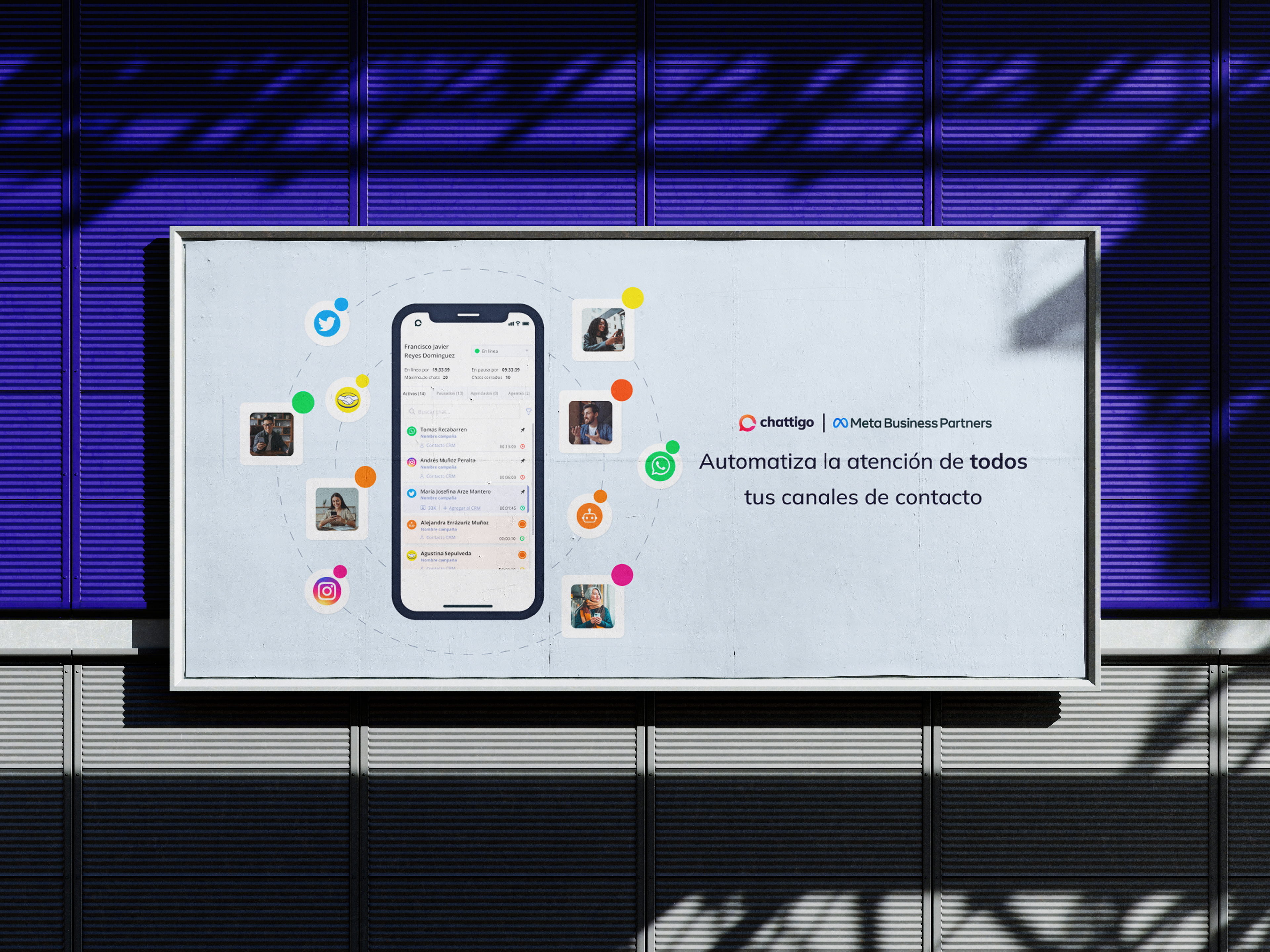
Chattigo is an omnichannel SaaS platform that helps businesses connect with their clients through messaging apps, bots and AI.
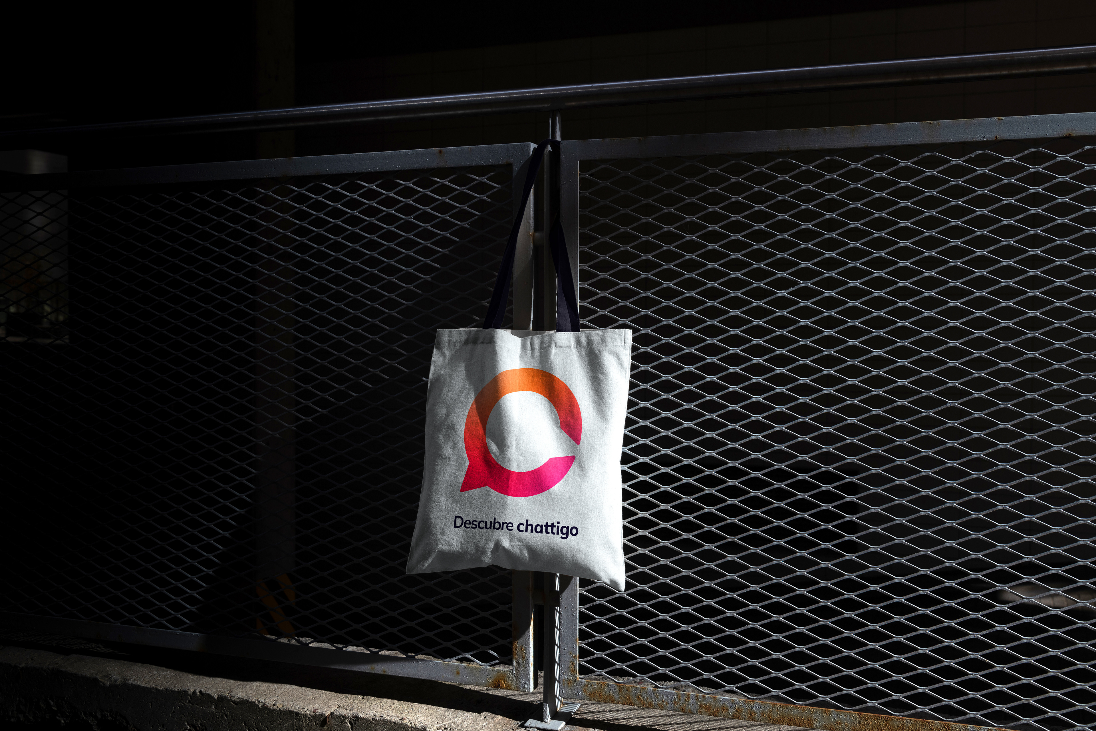
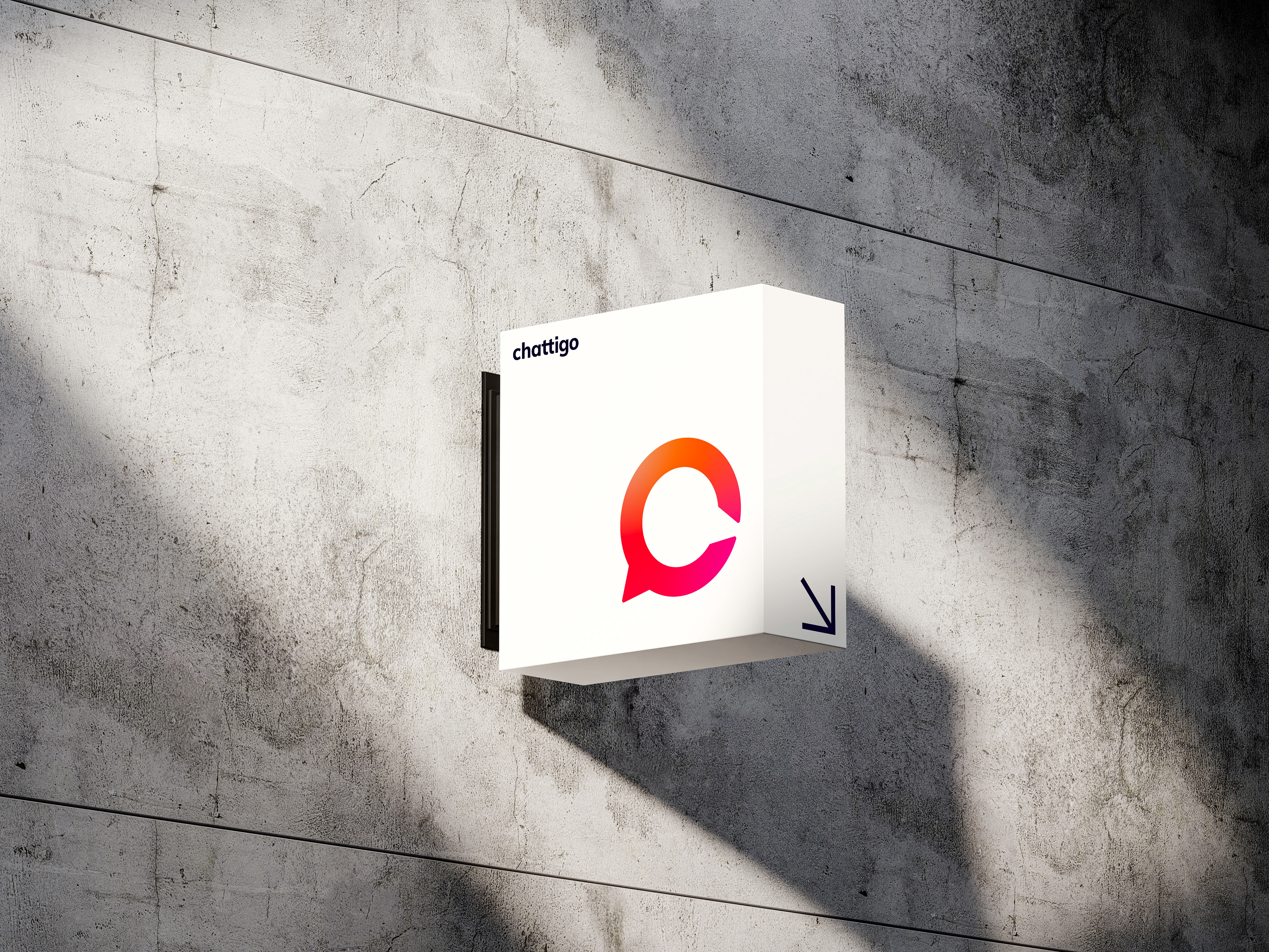
I joined the team as an in-house designer, producing graphic and motion pieces day to day. From that place, I started noticing things: a palette that was too wide, a logo with inconsistent typographic adjustments, and no real criteria for how the gradient should be used. I put together a restyling proposal and ran with it. The updated system went into production across all brand materials while I was part of the team.
I joined the team as an in-house designer, producing graphic and motion pieces day to day. From that place, I started noticing things: a palette that was too wide, a logo with inconsistent typographic adjustments, and no real criteria for how the gradient should be used. I put together a restyling proposal and ran with it. The updated system went into production across all brand materials while I was part of the team.
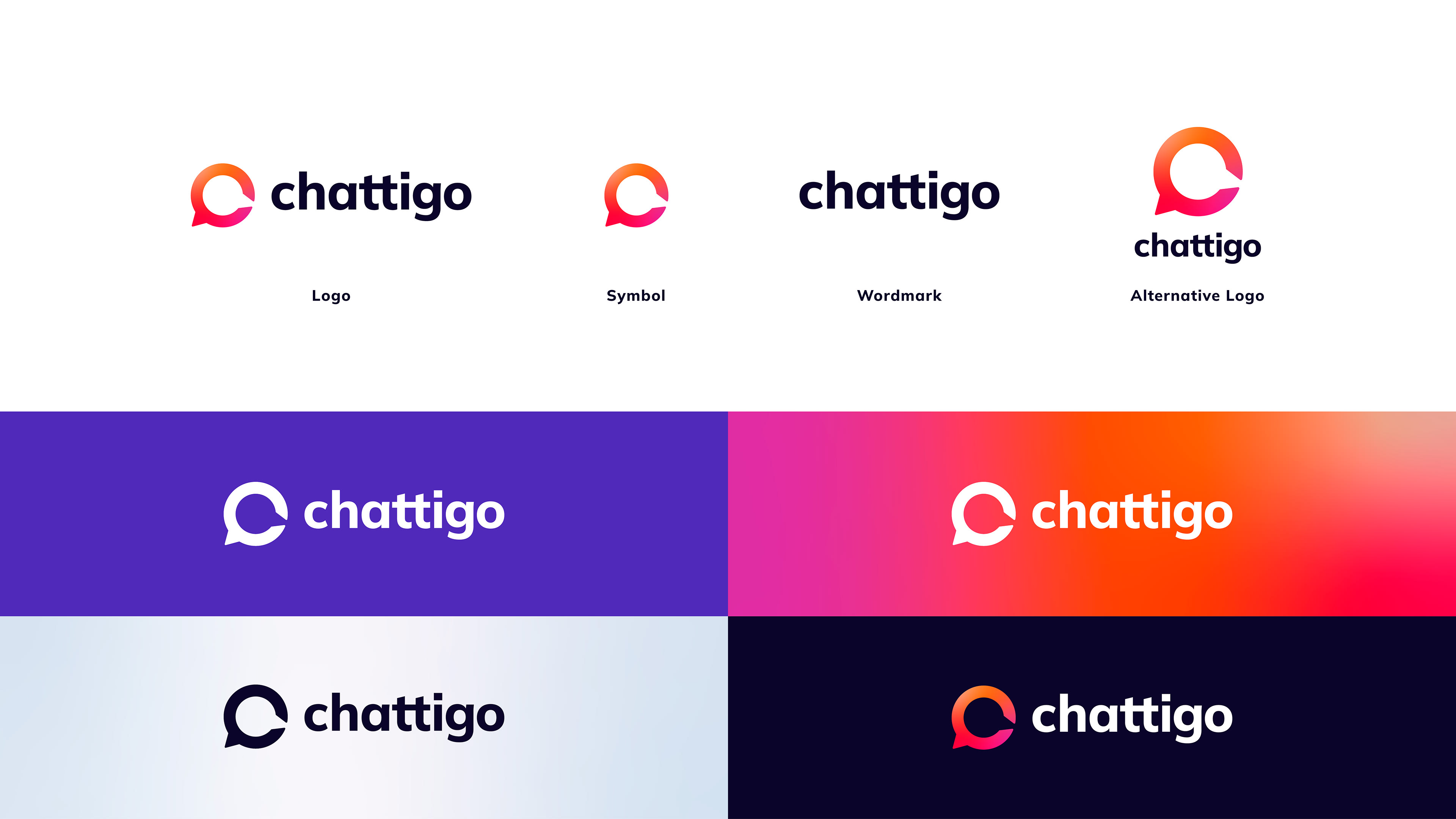
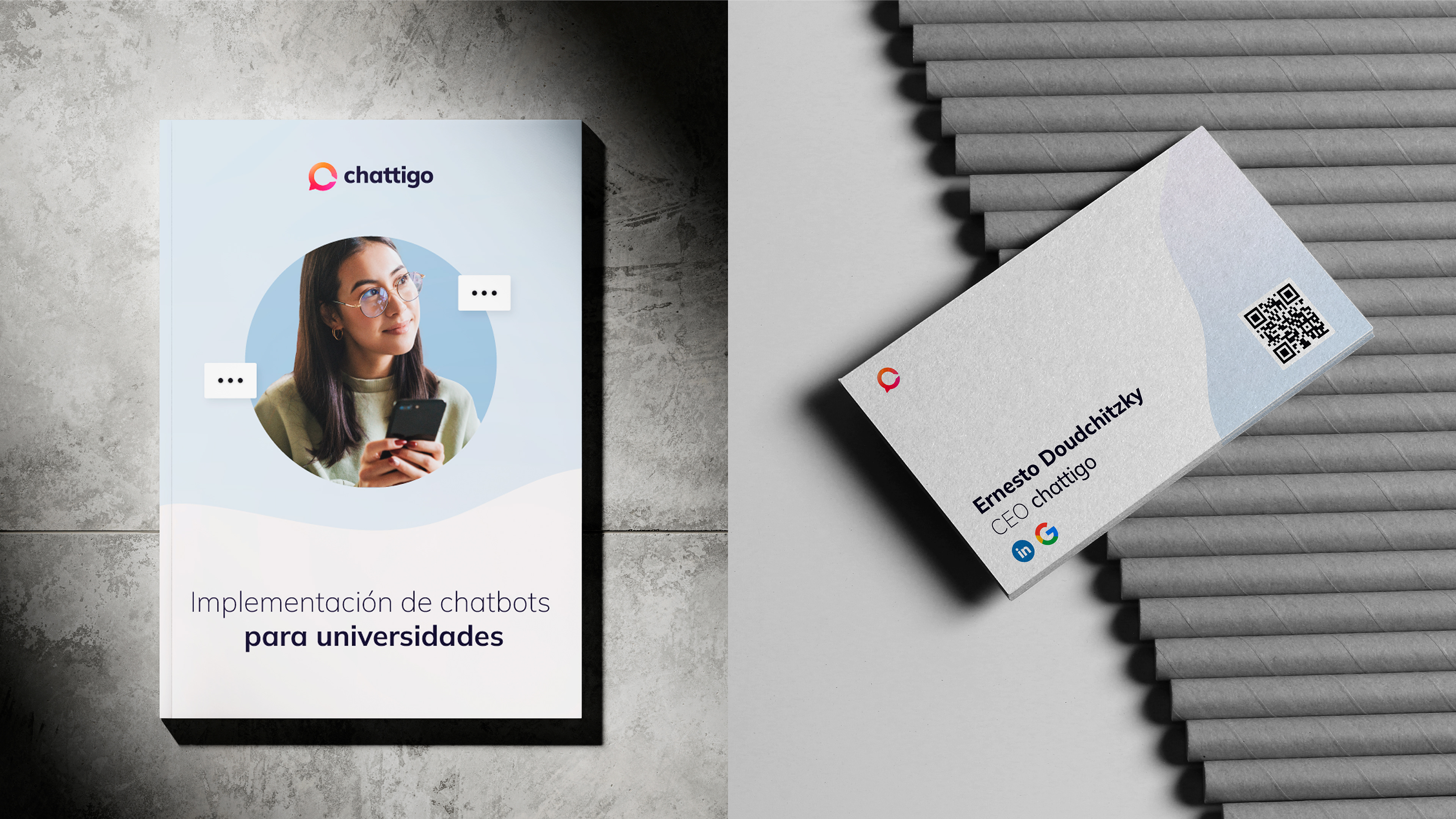
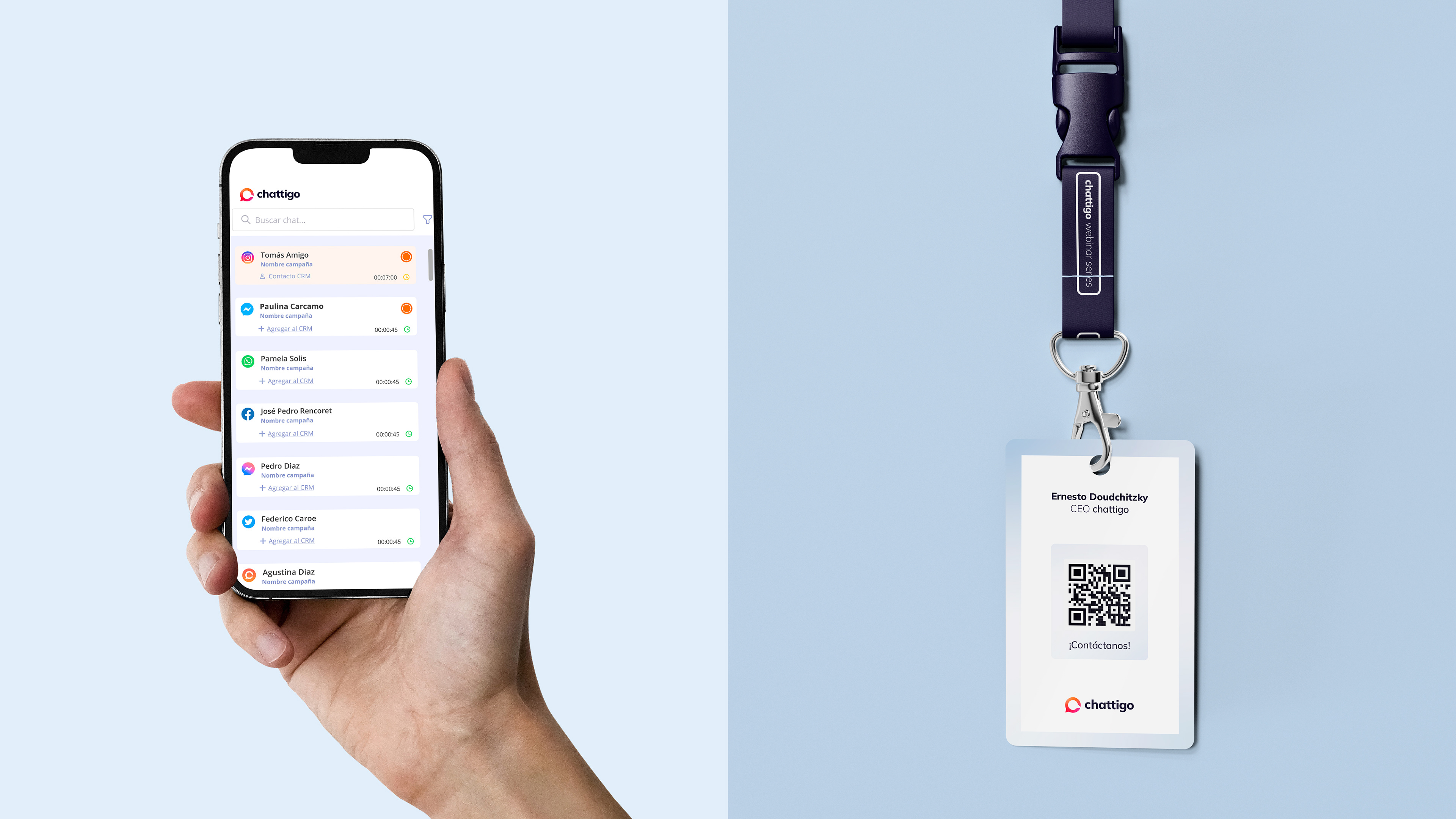
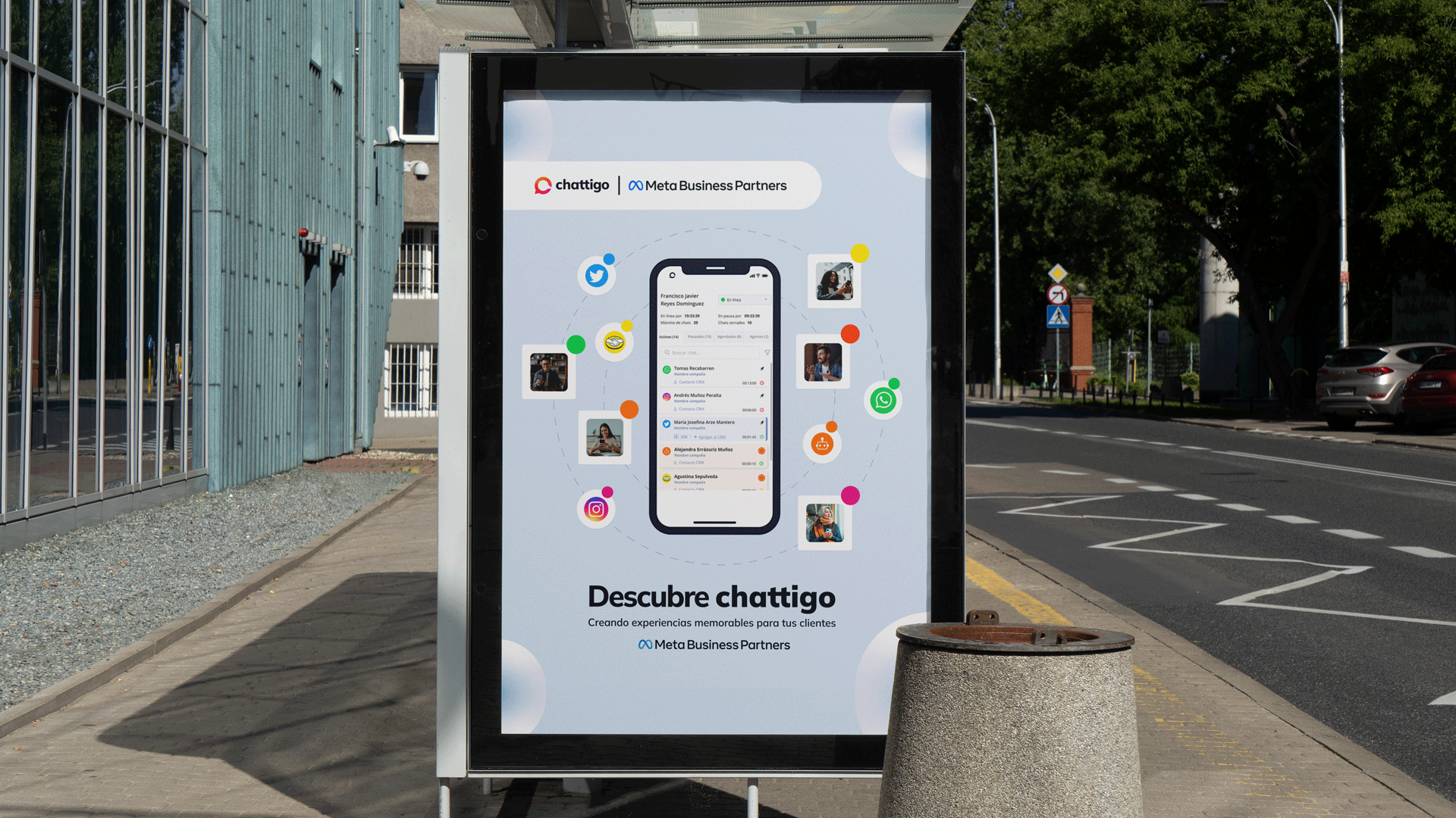
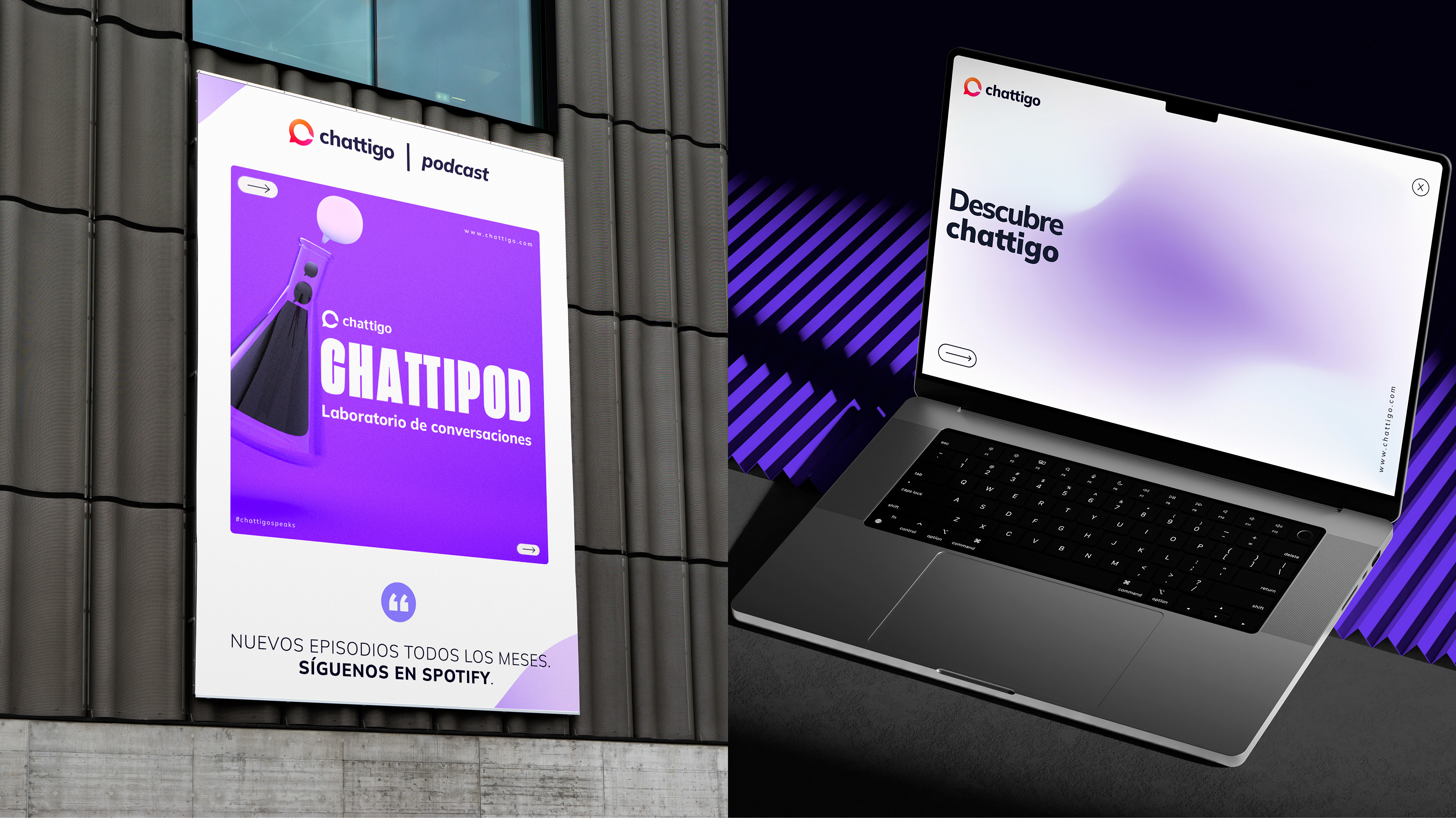
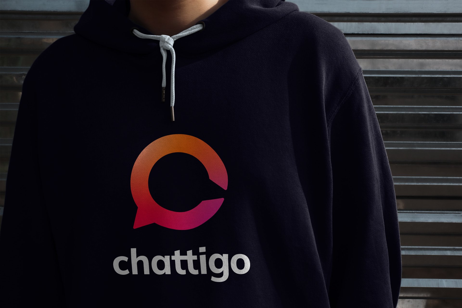
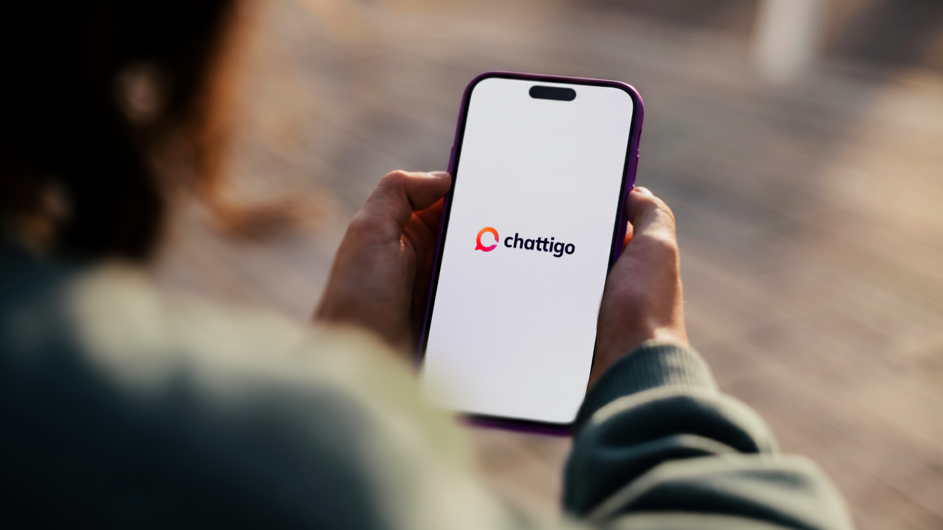
A restyling of the logo was undertaken to unify the image with the brand's communication proposal. The original logo structure is maintained, with slight changes to the typographic morphology and the color palette.
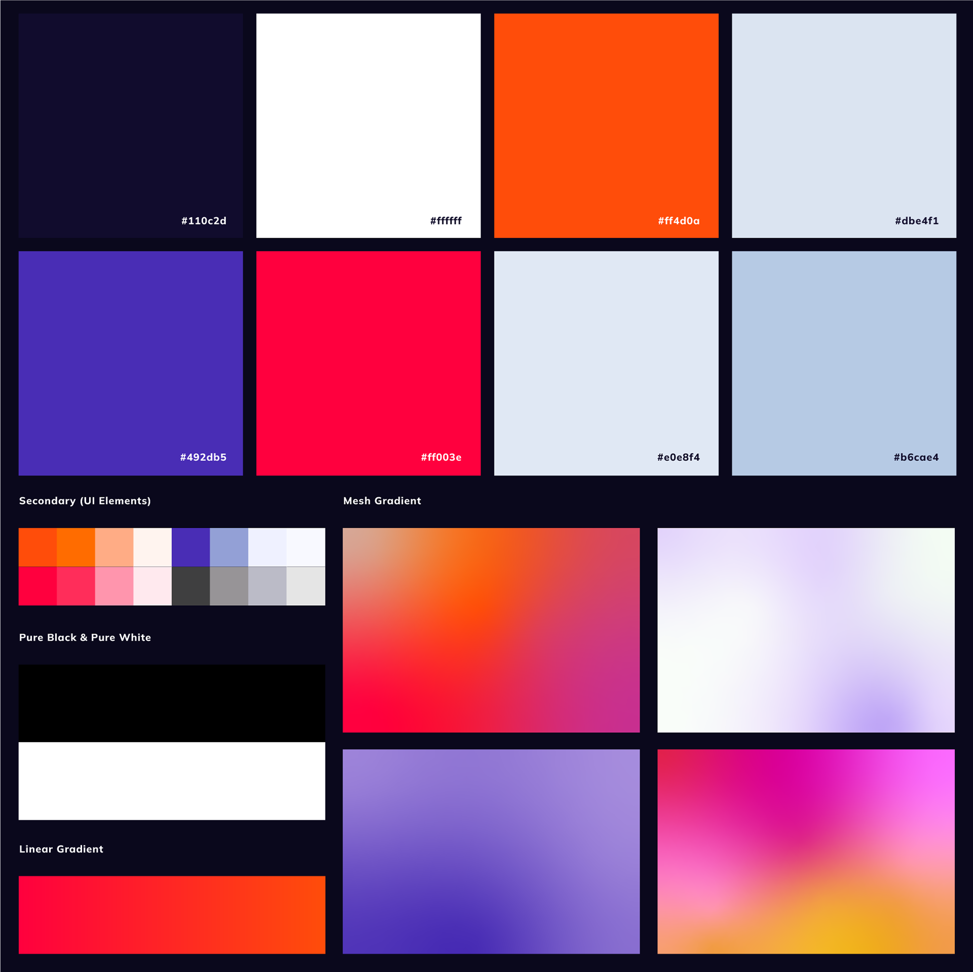
The palette
The original palette was too wide and had no usage specifications. In practice, this meant colors changed from piece to piece depending on who was producing them, especially when external studios or freelancers were involved. The desaturated tones made contrast difficult, so the full-color logo ended up being avoided in favor of the white version.
The original palette was too wide and had no usage specifications. In practice, this meant colors changed from piece to piece depending on who was producing them, especially when external studios or freelancers were involved. The desaturated tones made contrast difficult, so the full-color logo ended up being avoided in favor of the white version.
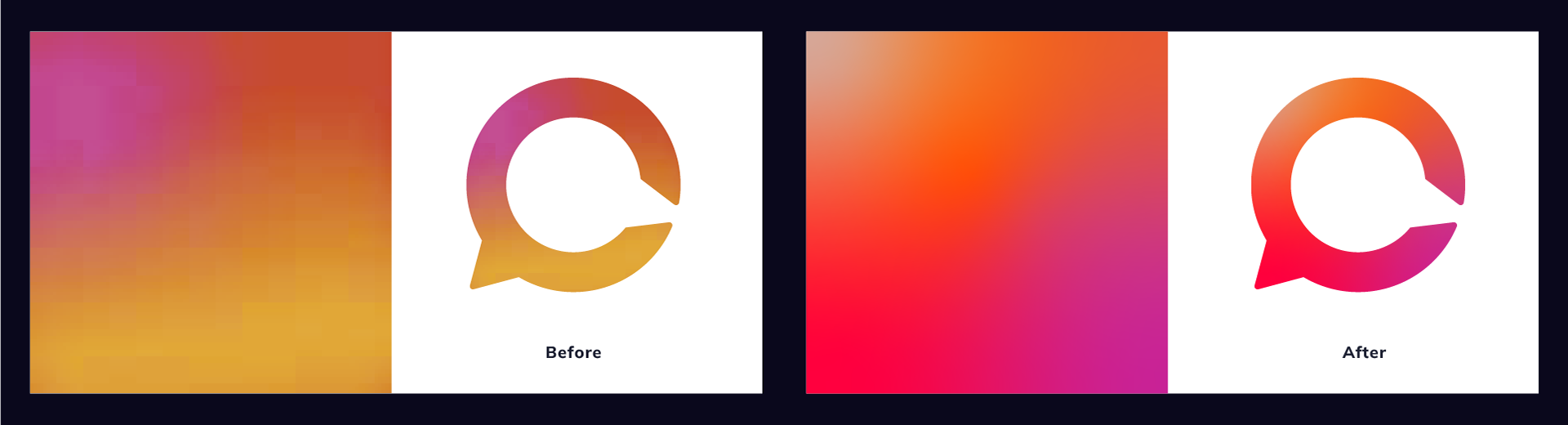
The gradient
The isotype gradient combined a pink and orange that were too close in tone to generate real contrast. The result was the same: people defaulted to the single-color version. The fix was finding two more saturated variations that actually work as brand identifiers alongside the wordmark.
The isotype gradient combined a pink and orange that were too close in tone to generate real contrast. The result was the same: people defaulted to the single-color version. The fix was finding two more saturated variations that actually work as brand identifiers alongside the wordmark.
The wordmark
The new wordmark color replaces black and degraded grays with a deep purple derived from the brand's own palette, darkened to ensure contrast while keeping harmony with the rest of the system. The goal was simple: make the full-color logo the default, not the exception.
The new wordmark color replaces black and degraded grays with a deep purple derived from the brand's own palette, darkened to ensure contrast while keeping harmony with the rest of the system. The goal was simple: make the full-color logo the default, not the exception.
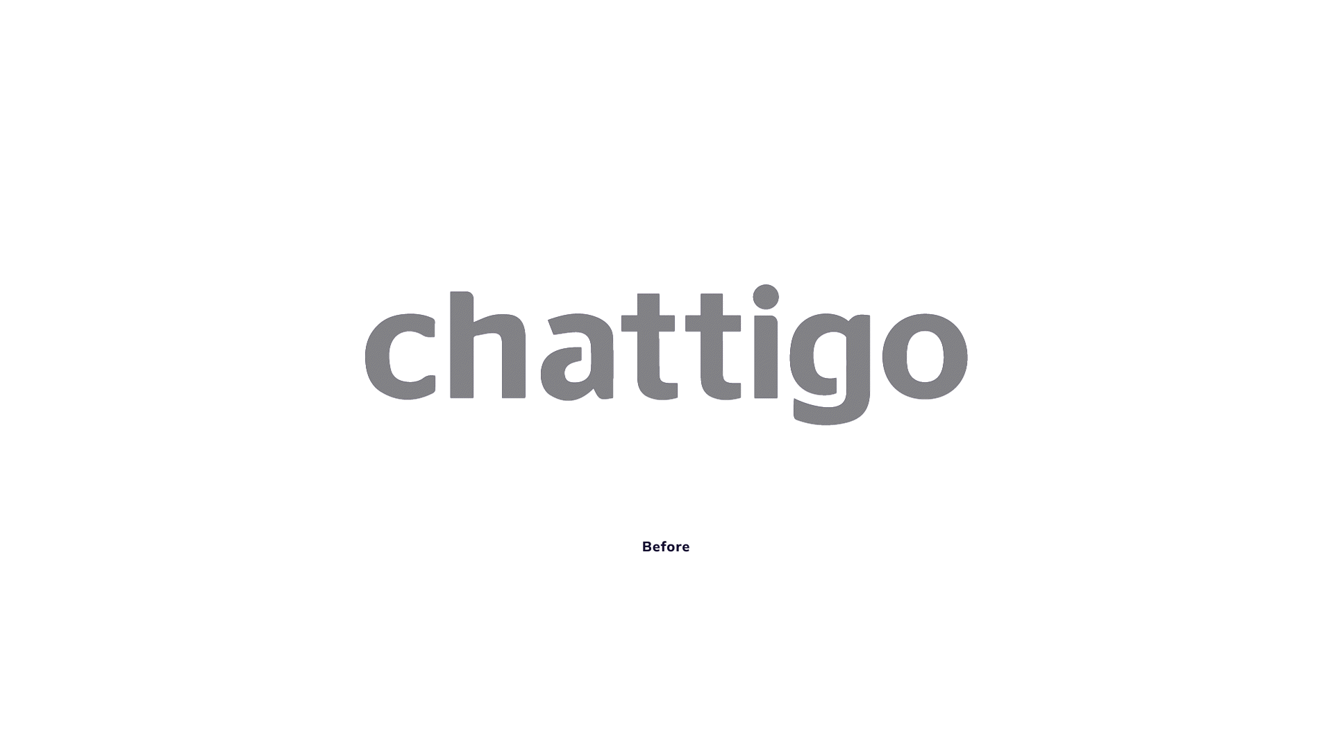
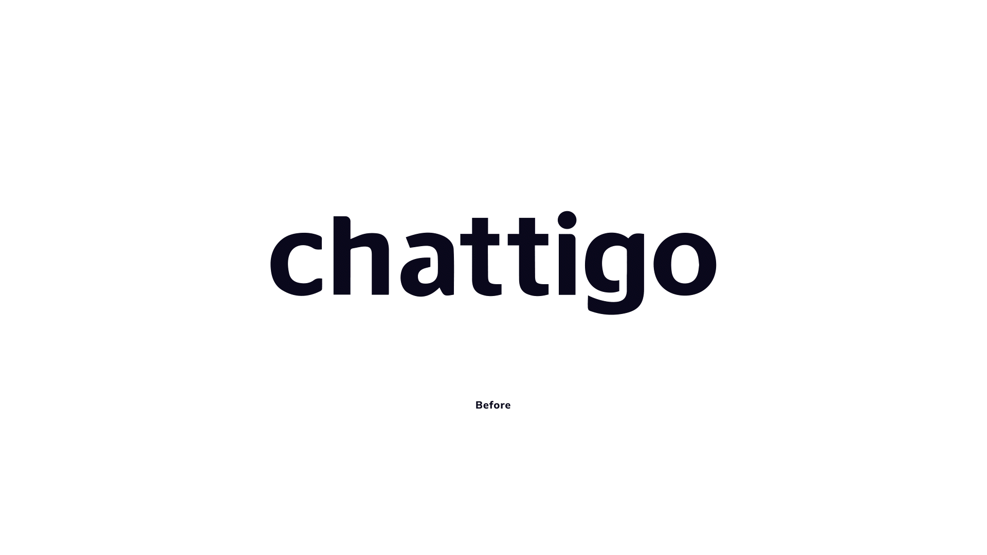
The type
The original logo used Open Sans as a base with manual adjustments on top. Those customizations created inconsistencies across letters, varying finishings, vertices, thicknesses, and the negative space felt unresolved. The cutout shape read more like a stencil than something that belonged to a tech brand. The restyling addressed all of that.
The original logo used Open Sans as a base with manual adjustments on top. Those customizations created inconsistencies across letters, varying finishings, vertices, thicknesses, and the negative space felt unresolved. The cutout shape read more like a stencil than something that belonged to a tech brand. The restyling addressed all of that.