SevenLabs
Visual Identity · 2024
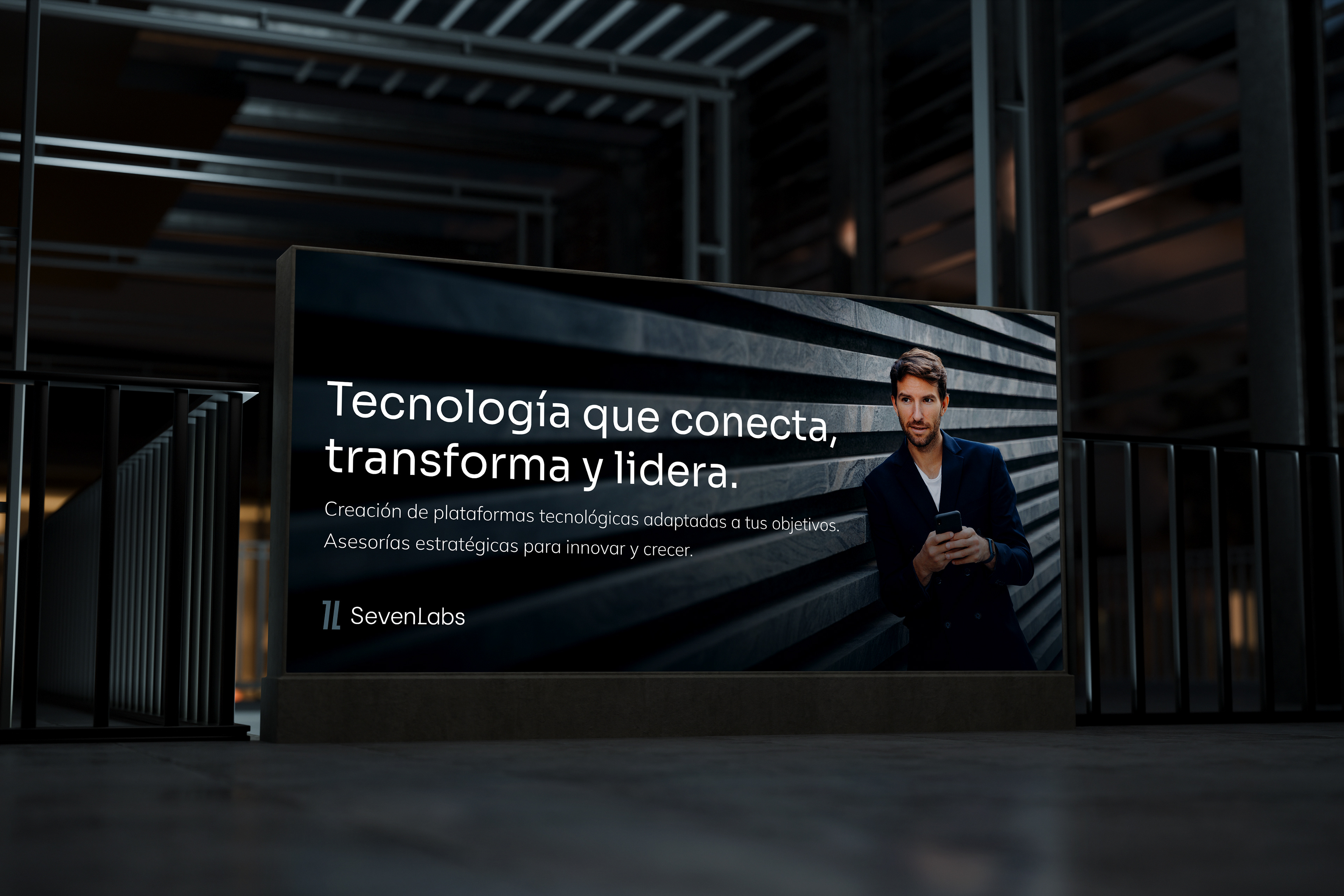
SevenLabs is a technology advisor and mentor with a clear mission: identify, map and build creative solutions for innovative projects. It supports tech ventures from the very beginning, providing strategic guidance in the search for new growth opportunities.
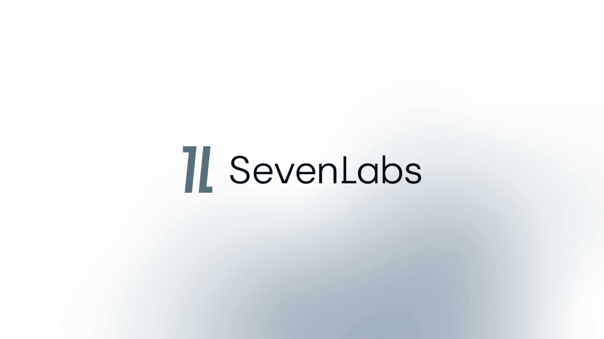
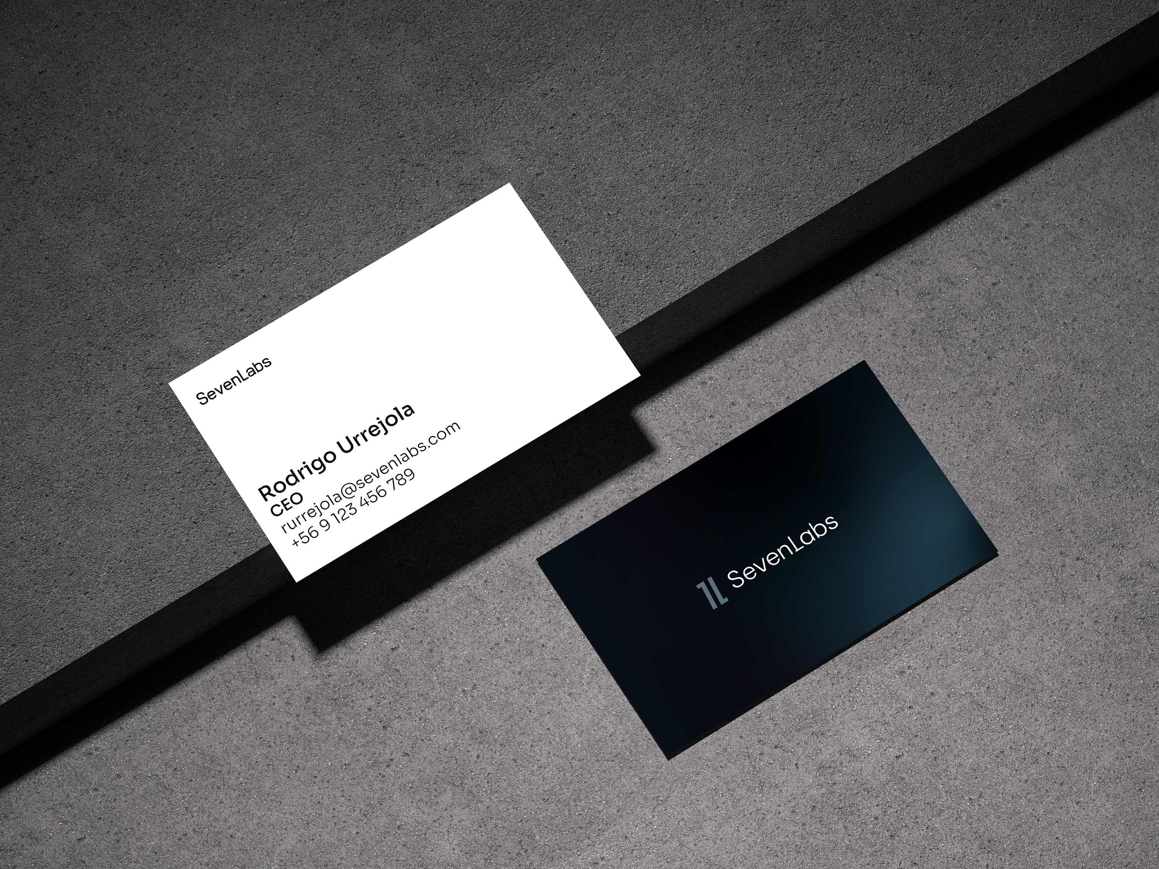
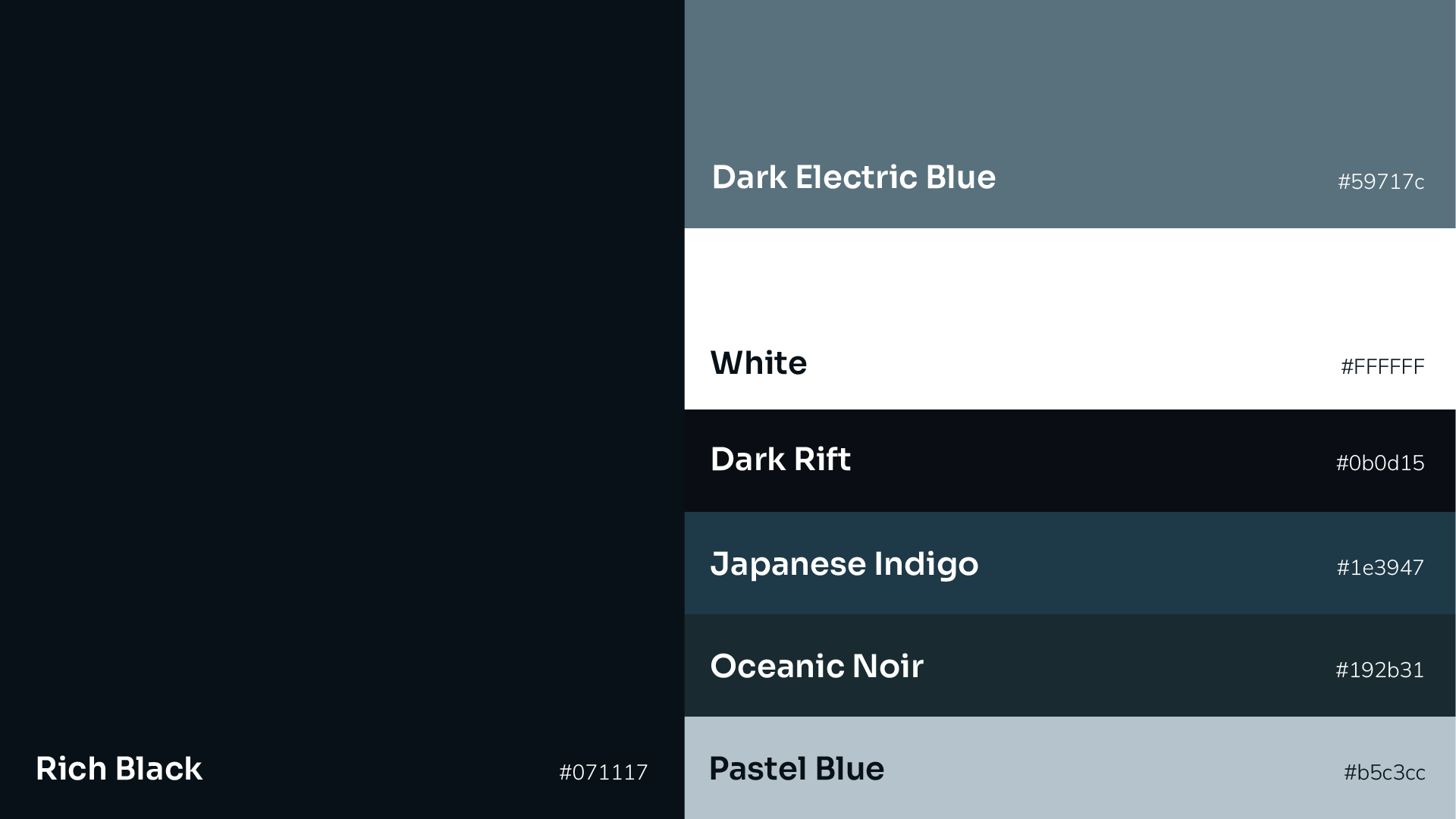
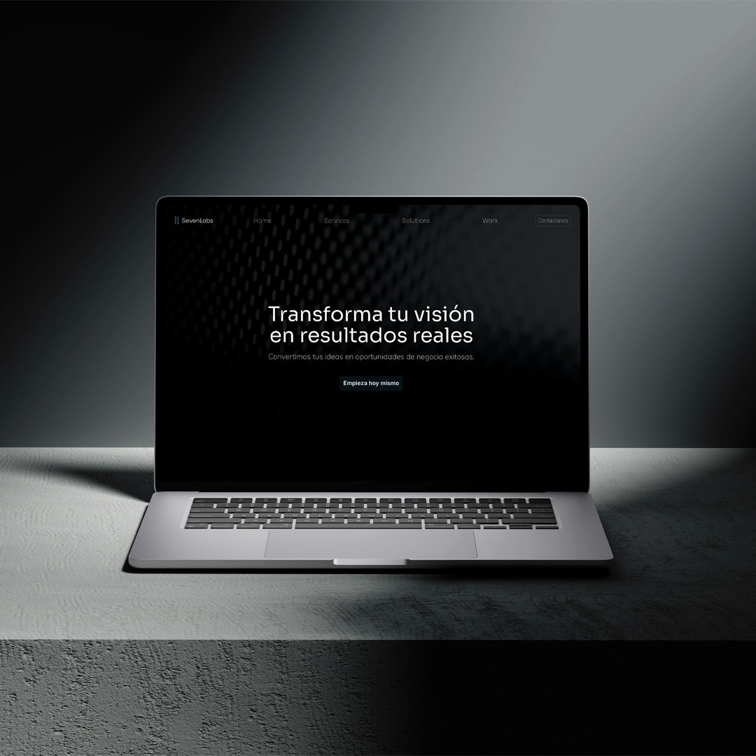
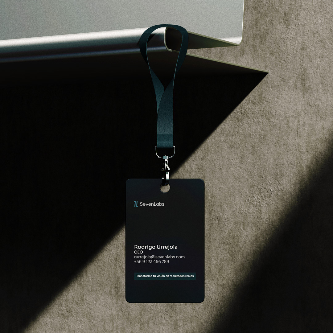
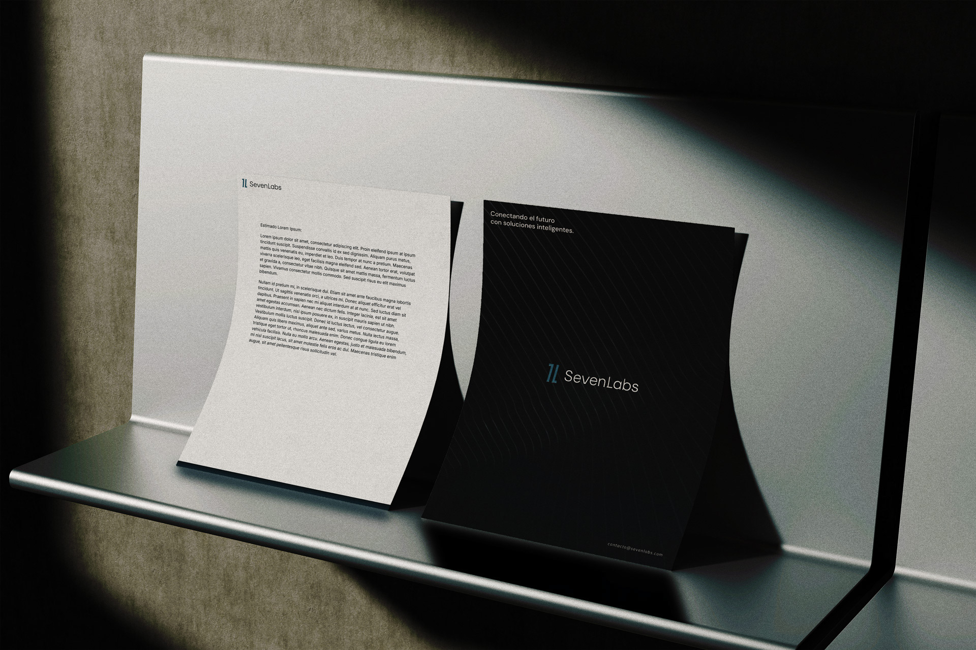
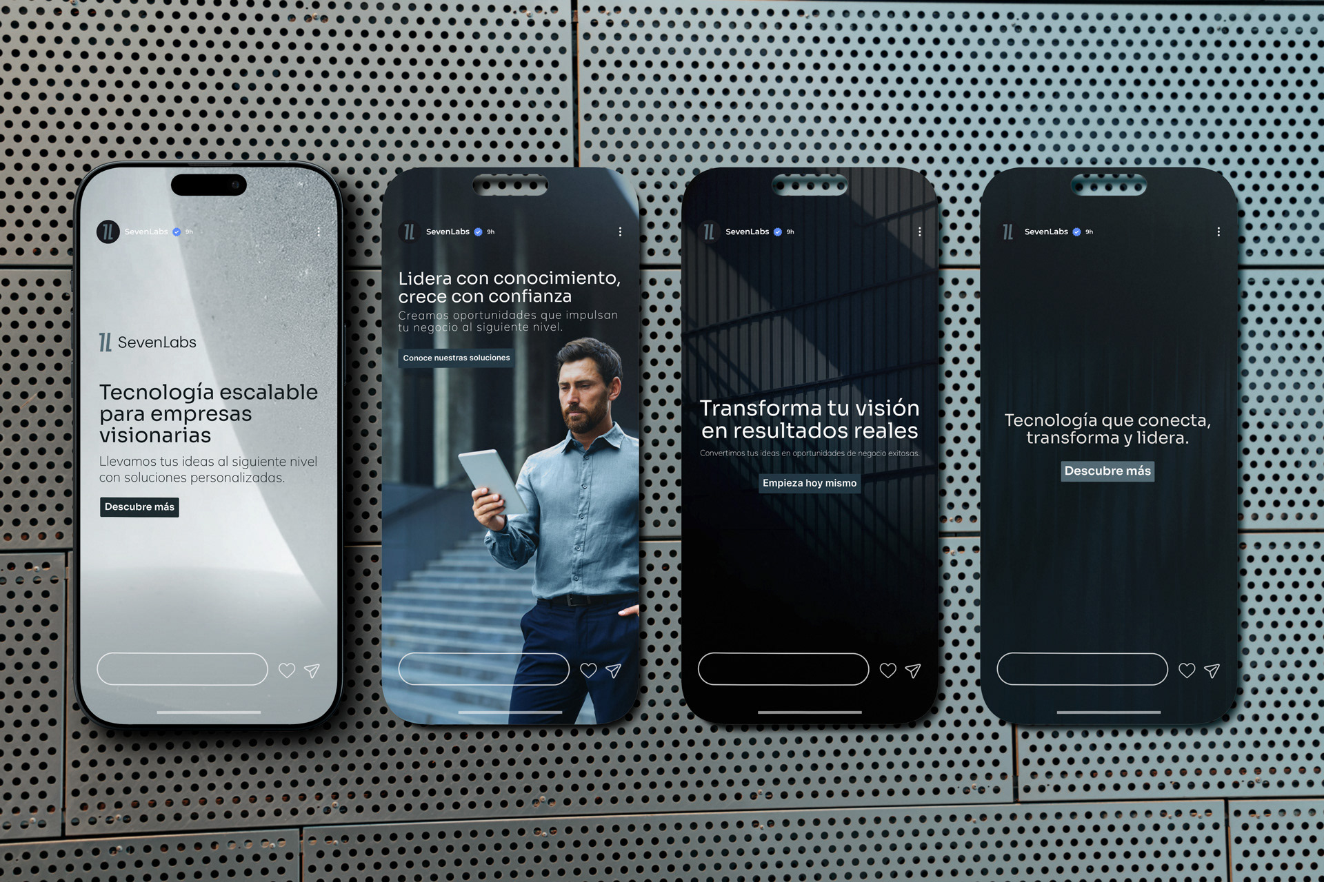
The brief was clear: sober, premium, tech, no shortcuts. Working with a name that lives in a crowded space meant the visual identity had to do the heavy lifting and the logomark is where that happened.
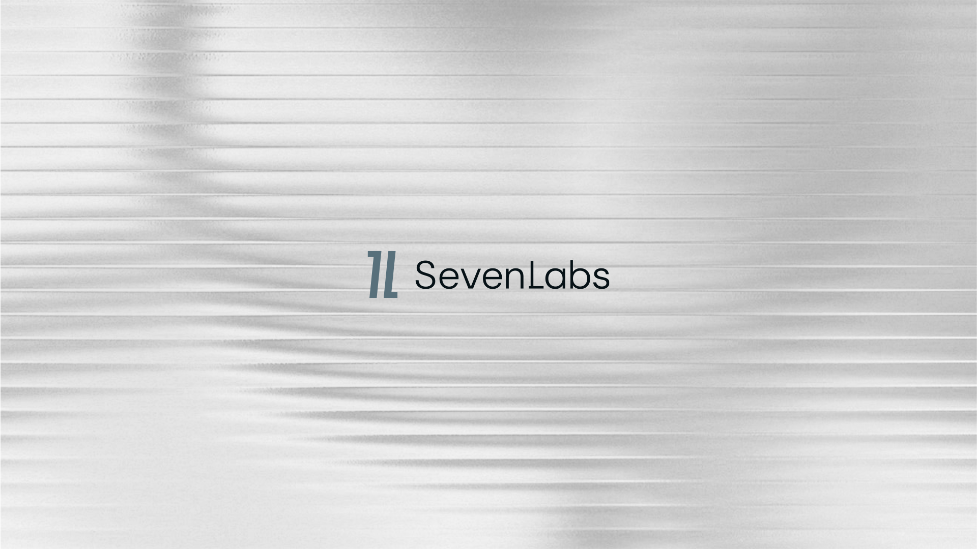
It’s a reinterpretation of the quotation mark, a symbol at the core of both code and human communication, carefully shaped to carry the initials "7" and "L", establishing a direct visual connection to the brand name and reinforcing its innovative, forward-thinking identity.
My Role: · Naming Strategy · Logomark Design · Visual Identity · Brand Collateral